CSS responsive images, max-width and captions
conceived
Working on a small project recently I came across a frustrating little issue when trying to use responsive images with a caption (demo).
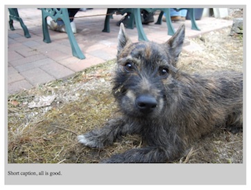
The problem arises when a rendered caption is longer than the width of the image it belongs.
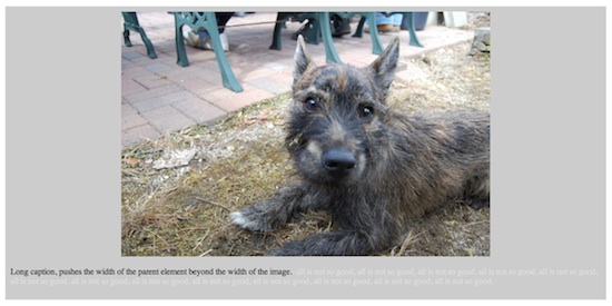
Images in responsive designs need to be marked max-width: 100%; so that the content can naturally flow to the width of the page. However without an explicit width when a long caption is encountered it can push the container wider than the natural 100% width of the image. When accompanied by styles on the parent such as background, it can have unsightly consequences.
A simple answer would be to apply a max-width: Npx; to the parent element — N being the width of the image. However unless you can guarantee that every image is going to be that same width, we have another problem.
I could have (and nearly did) modified my custom CMS to store the dimensions of images upon their upload to the system. I only nearly did, but because I store both full size and thumbnails of each it wasn't going to be as simple as adding a couple of columns to the database. And also what if I decide store full/300px/150px sizes of each image. That solution wouldn't scale.
So I settled with the following snippet of javascript (using jQuery). Upon the page loading it gets the natural width of the image, and applies that to the parent as a max-width.
$(document).ready(function(){
 var img = new Image();
 img.onload = function(){
  $('figure').css('max-width', this.width);
 }
 img.src = $('figure img').attr('src');
});
Using javascript in this way isn't ideal, if anyone has a better solution please do let me know :)
Comments? Tweet me @mealybar, smoke signals, or homing pigeon, or something :)